After several successful growing seasons, the folks at Ort Gardens wanted help creating a new, unique, and versatile logo.
While its owners have been farming and raising animals in the Finger Lakes region of New York for years, Ort Gardens is a fairly new undertaking for the team. Their main focus is producing high-quality potted plants like small fruit trees / bushes, herbs, and perennial flowers. In addition, they create floral arrangements and wreaths, and raise livestock.
After some discussions (including one about how this logo would be used and what their brand goals were), a visual direction became clear. We needed to create a logo that:
- Highlighted all of the different “services” the farm offered.
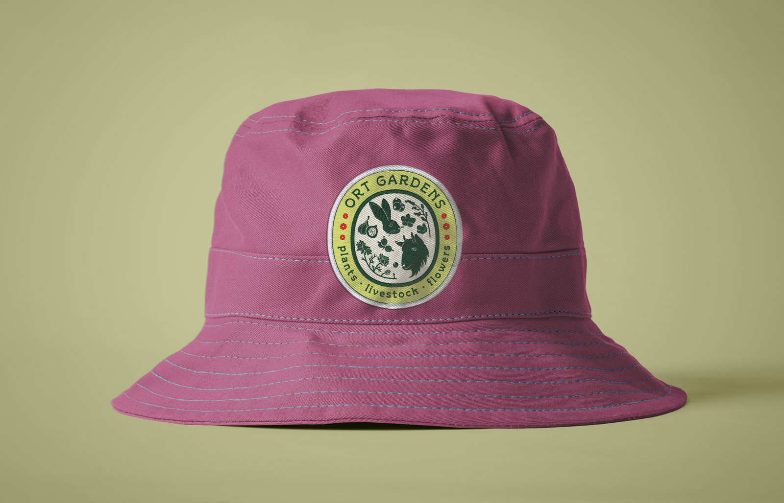
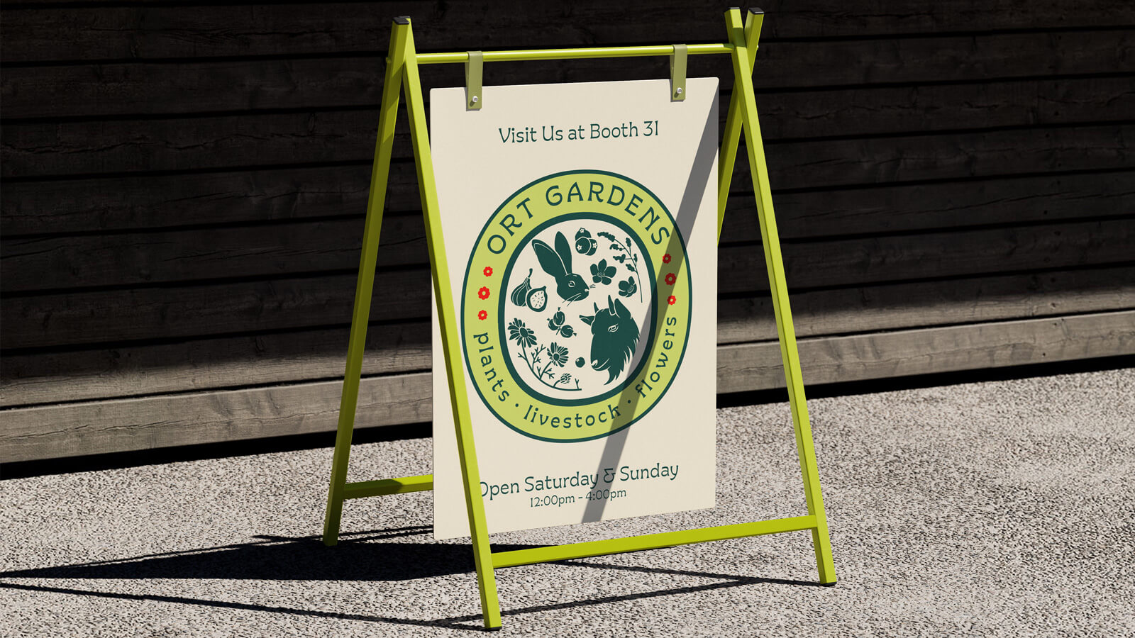
- Worked well in physical applications like print-outs, merch, and signage, but could also be deployed in a more limited way in digital ones like their website, email newsletters, and social media accounts.
Process
For this logo design project — like all my logo design work — I started out by making a list of words and short phrases based on my conversation with the company’s owners. This helps generate ideas for brand marks and lockups. For this project, the team at Ort Gardens had some ideas in mind; their thoughts helped me create that list.
Once that list is finished, sketching begins!
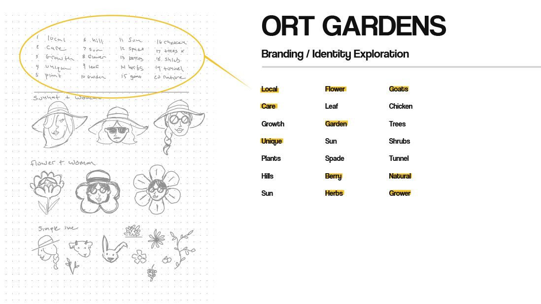
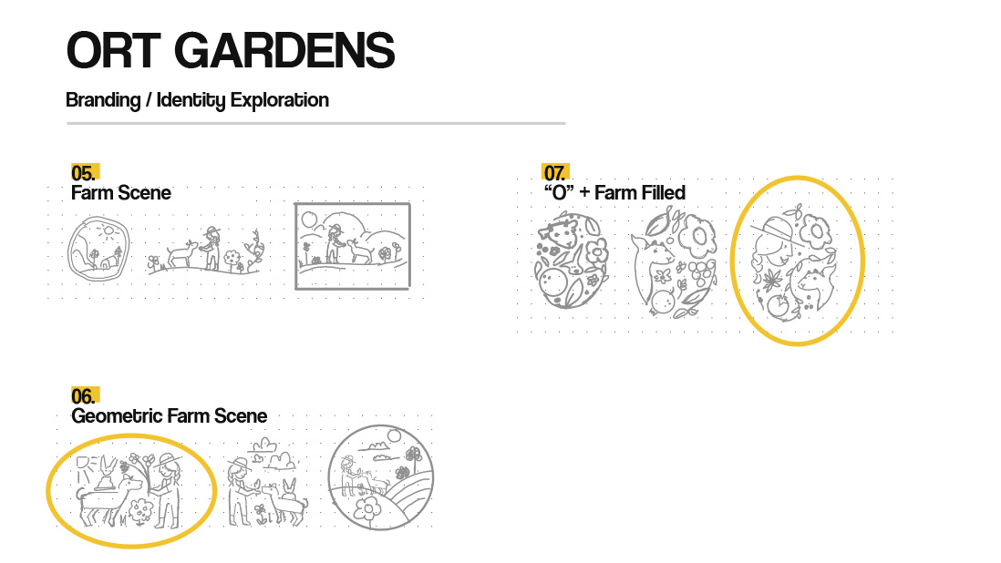
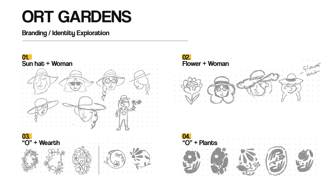
After another huddle with the client in which we discussed all the above directions, we decided on two concepts to push further. I took a look at these sketches (dubbed the “badge” and the “farm scene”) as a starting point for a final design. While exploring these ideas, I also took a look at some different ways of drawing the various individual components of each design.
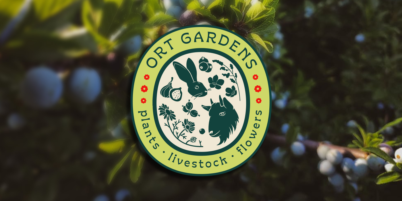
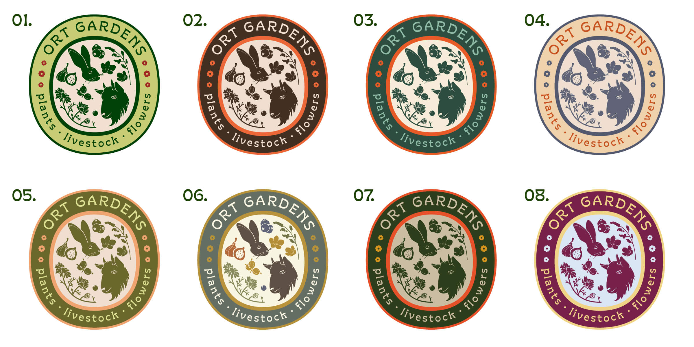
This style exploration, along with a quick email check-in with the client, led to all of us agreeing to solely pursue the “badge” idea. It also led to the folks at Ort Gardens realizing they would much prefer a more hand-drawn look to a more modern geometric execution. Something that is, admittedly, a bit out of my comfort zone, meaning this project became even more exciting!
Once I completed the badge, we played with color. We looked at a variety of color combinations, and taking into account the client’s preferences and what made sense for the brand, we landed on a dominantly green palette with a bit of floral red. This conveys the nature of the organization’s work with just a quick scan.
The Full Package
After presenting the finished badge to the team, I created a logo mark and some text lockups (for their team to use as a secondary brand mark as needed). The result is a fun, slimmed-down version of a responsive logo system that conveys the farm’s offerings, and will be an eye-catching addition to their market stands this spring.