The Cancer Nutrition Consortium asked the design team at Attention Span and me to help put together a physical cookbook for their expertly designed, research-backed recipes.
Challenges
The main hurdle I and the design team needed to clear was deciding the look and feel of the cookbook. Since this project coincided with a website redesign for the organization we were able to use a lot of that work to inform this project. The team and I decided to use a lot of the same design elements in this project as we did on the website so that the consortium’s brand would feel consistent.
Process
We knew the cookbook needed to feel both approachable and institutional so that readers would feel comfortable with it but also trust its content.
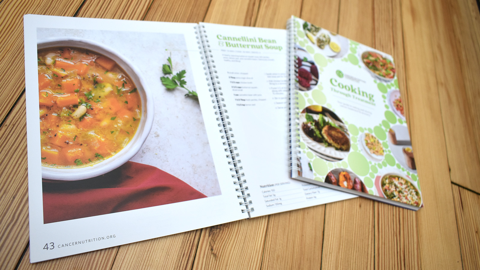
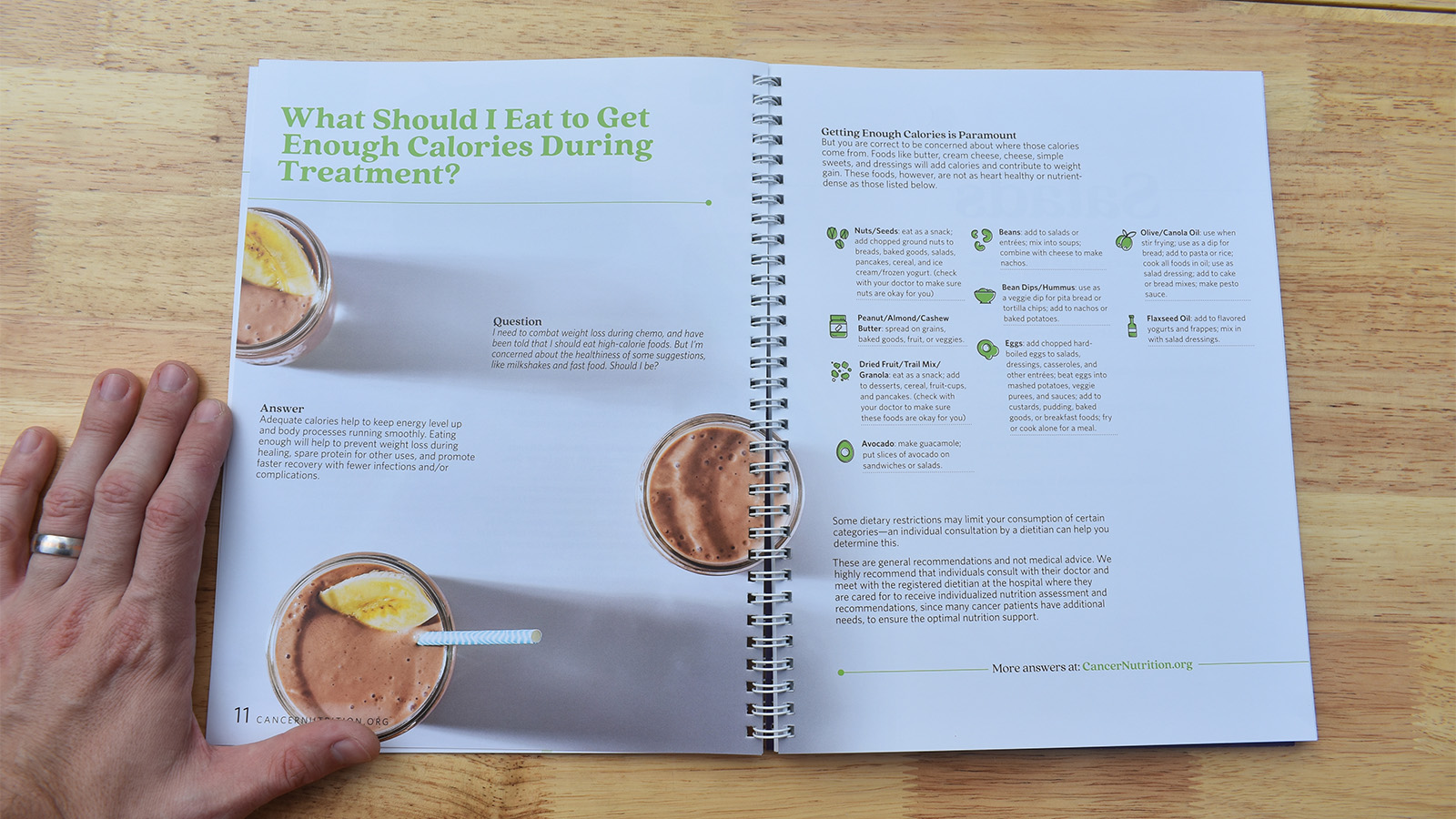
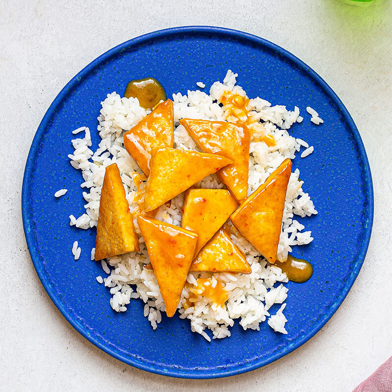
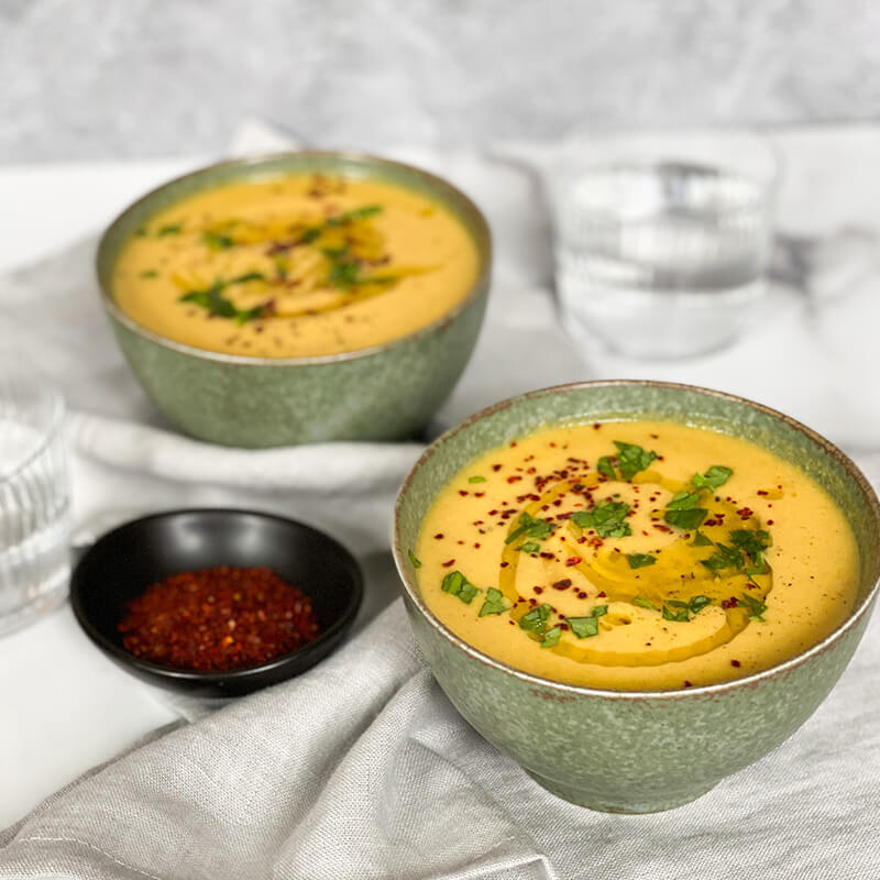
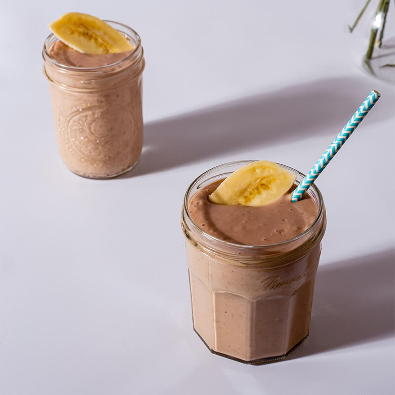
We selected a more editorial header font, and used inviting colors and photography to convey approachability while also using large fields of white with light cream colors; this would help on two fronts. One, evoking the feeling of a traditionally professional or functional experience and two, ensuring the main focus of each spread was on in the recipes themselves and the photography.
After completing the design preproduction I took the lead on wire-framing the cookbook and creating our first content draft while managing the recipe photography process.
Results
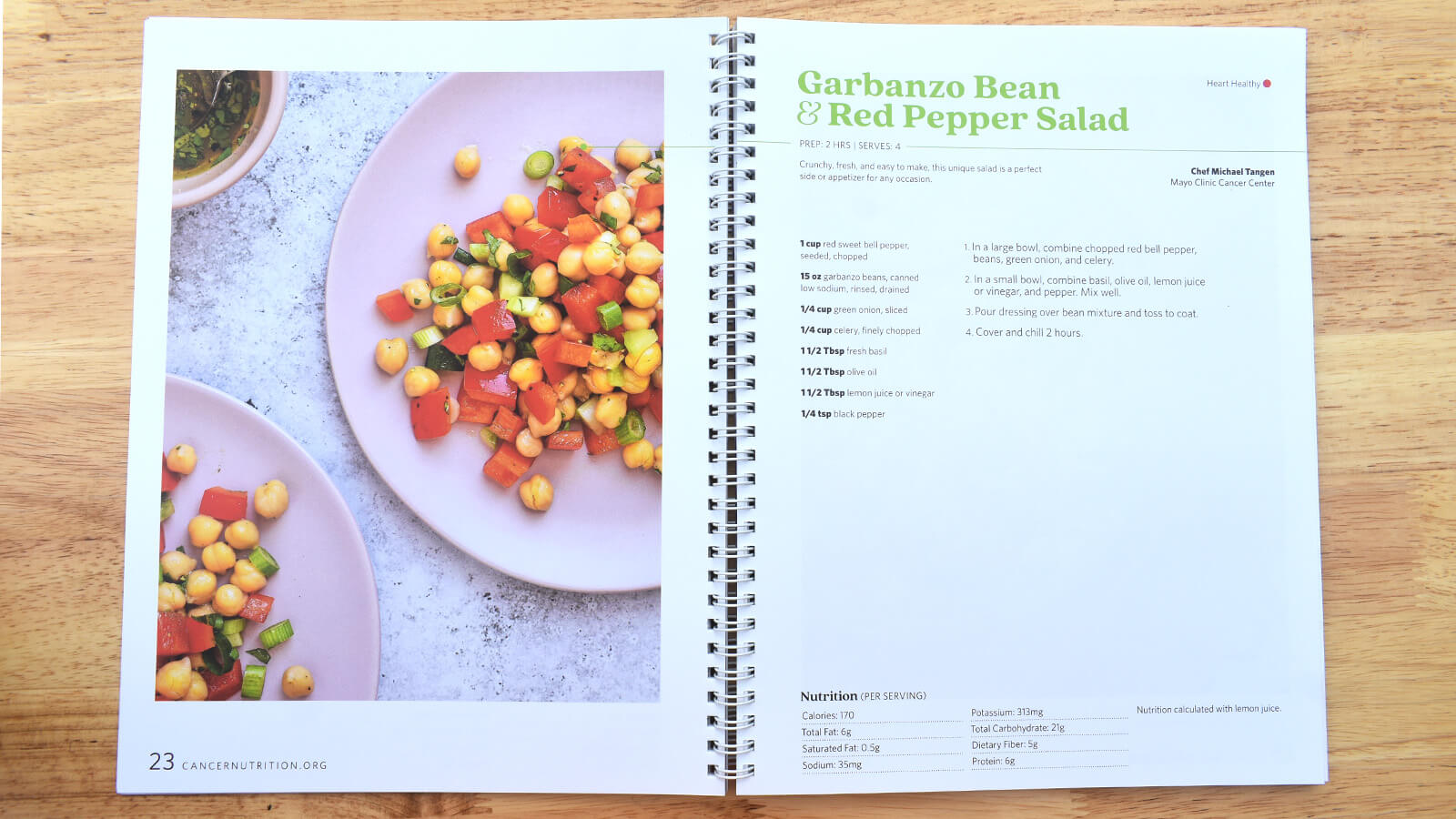
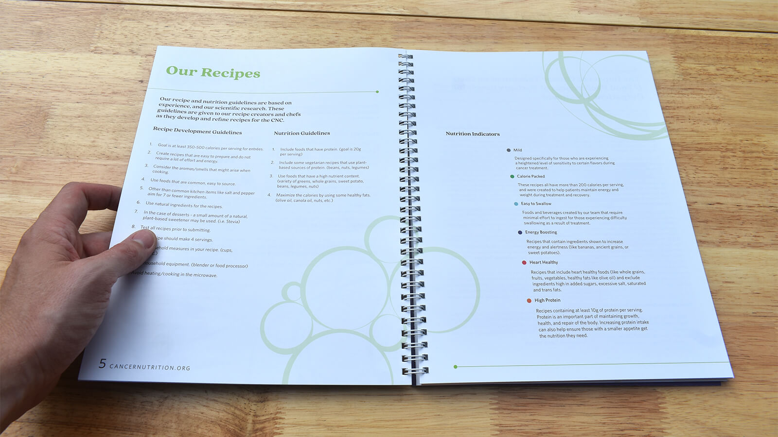
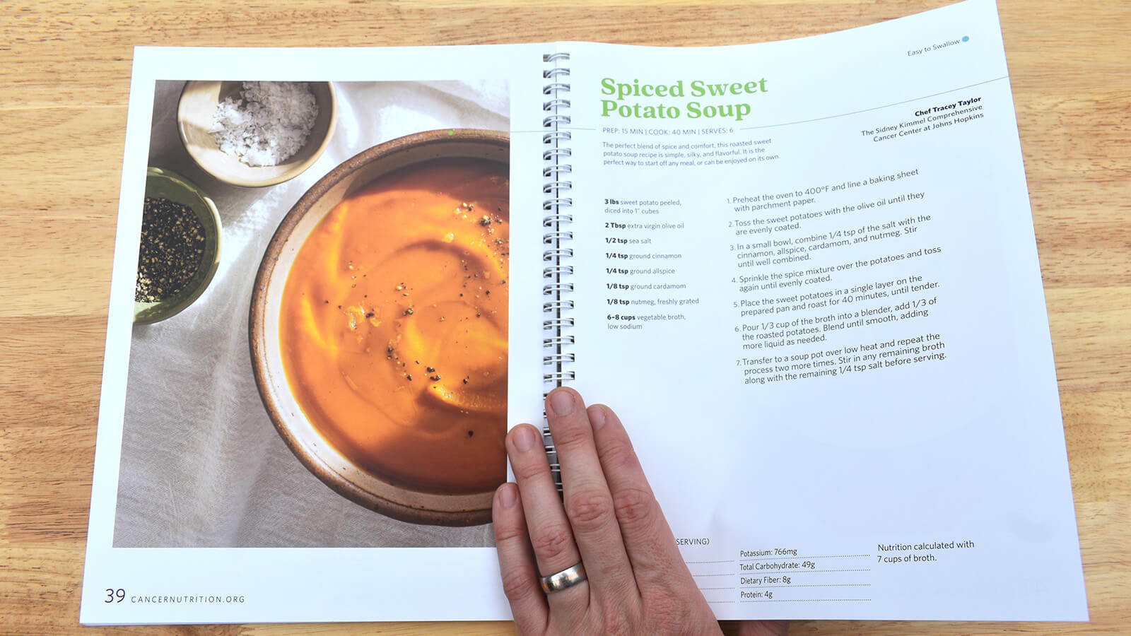
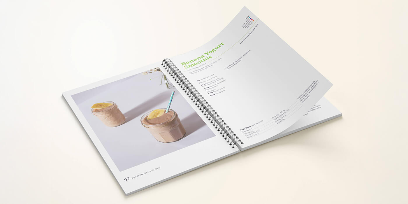
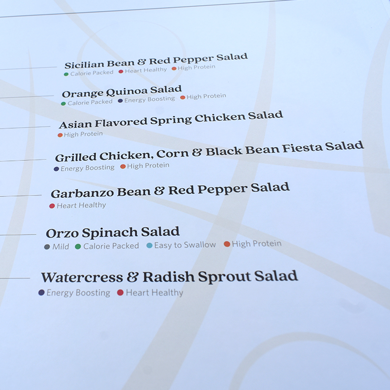
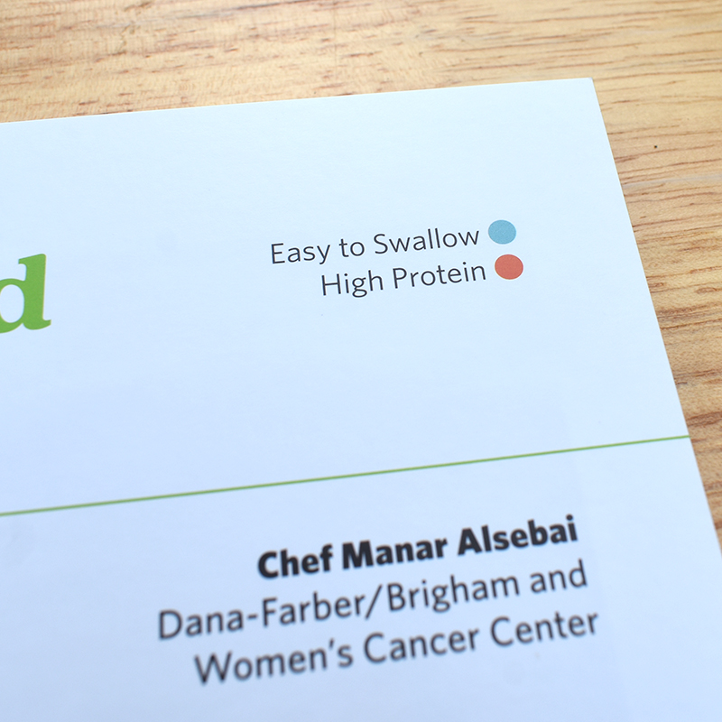
At the end of project we had created a functional, beautifully designed cookbook. It contains nearly 50 recipes, all of which have nutritional indicators associated with them so users can easily identify and select recipes created with their specific taste changes in mind. You can purchase the cookbook on the Cancer Nutrition Consortium’s website.