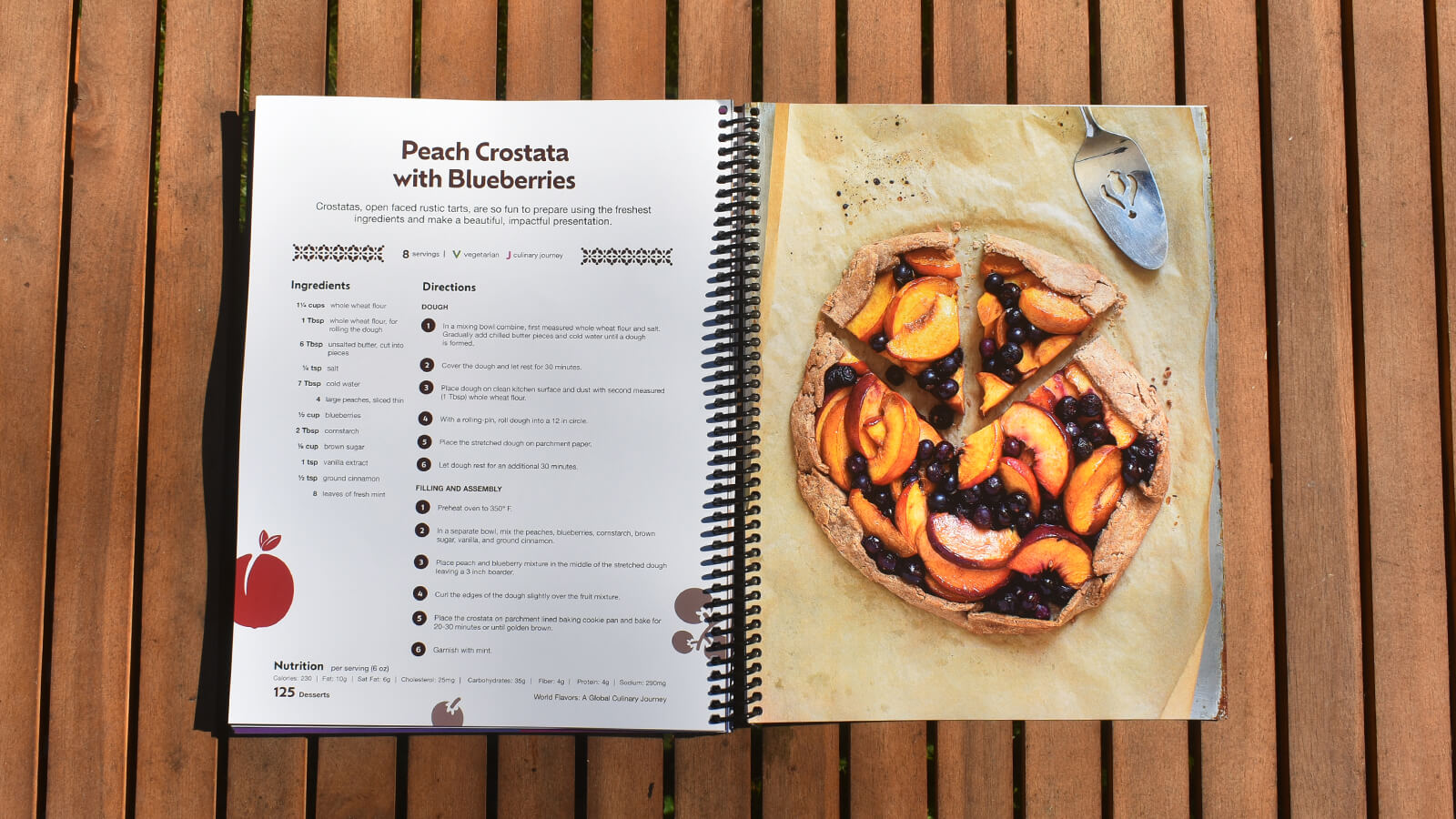
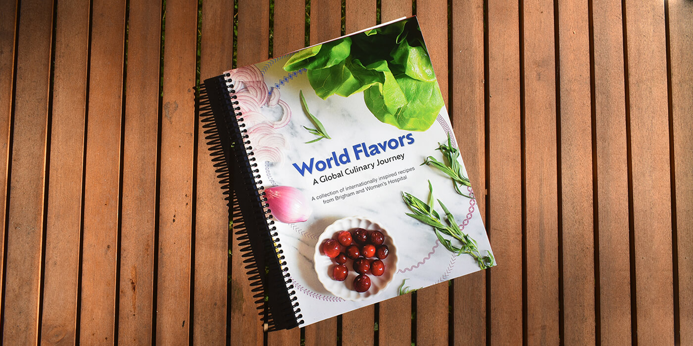
After the success of Cooking Through Treatment — a cookbook created for the Cancer Nutrition Consortium — Brigham and Women’s Hospital in Boston, MA approached the team about tackling their own collection of recipes.
The Challenge
Brigham and Women’s Hospital had been working for years to collect recipes that represented the diverse variety of cultures among both their team and patients. Once compiled, their team called in the Attention Span design team to help shepherd the list of recipes from Word docs to a designed, published cookbook that reflected the gravitas of the institution as well as highlighted the beauty and variety of the content.
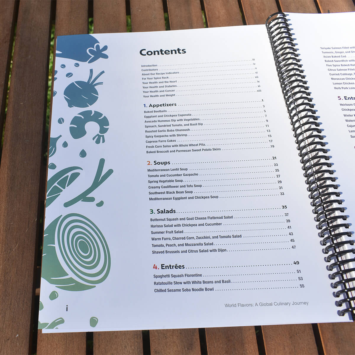
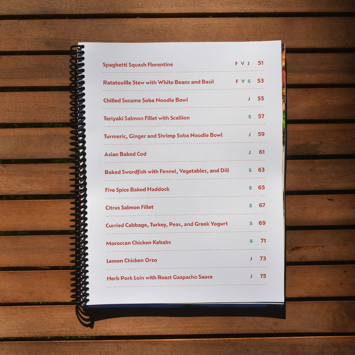
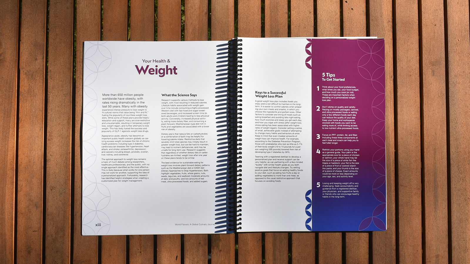
Unlike many cookbooks, “World Flavors Cookbook” had a few other considerations to take into account. In addition to several health and nutrition articles in the front of the book, each recipe included nutrition information and recipe indicators to help readers more quickly choose a dish from the collection.
Our Approach
I led both the project and the design of the book itself, starting with some “More… Than” statements to help define the project’s big picture goals with the client.
Together we decided the book should be:
- More Approachable than Institutional
- More Established than Disruptive
- More Scientific than Opinionated
- More Home-cooked than Food Service
We also decided on “Global”, “Helpful”, “Comforting”, and “Trustworthy” as the feelings our designs and photography should reinforce in readers.
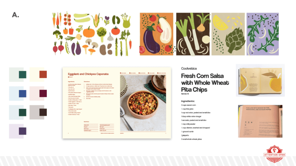
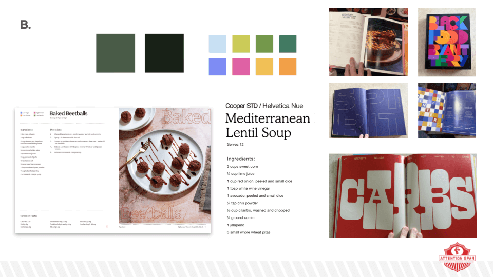
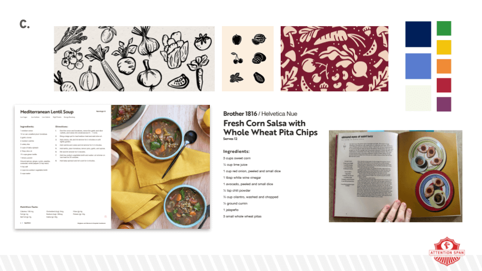
With all that in mind, the design lab took to the bookstores, looking at countless other cookbooks, food magazines, and other relevant work for inspiration. After presenting some options to the client, we landed on an approach fairly close to the one used in the final book.
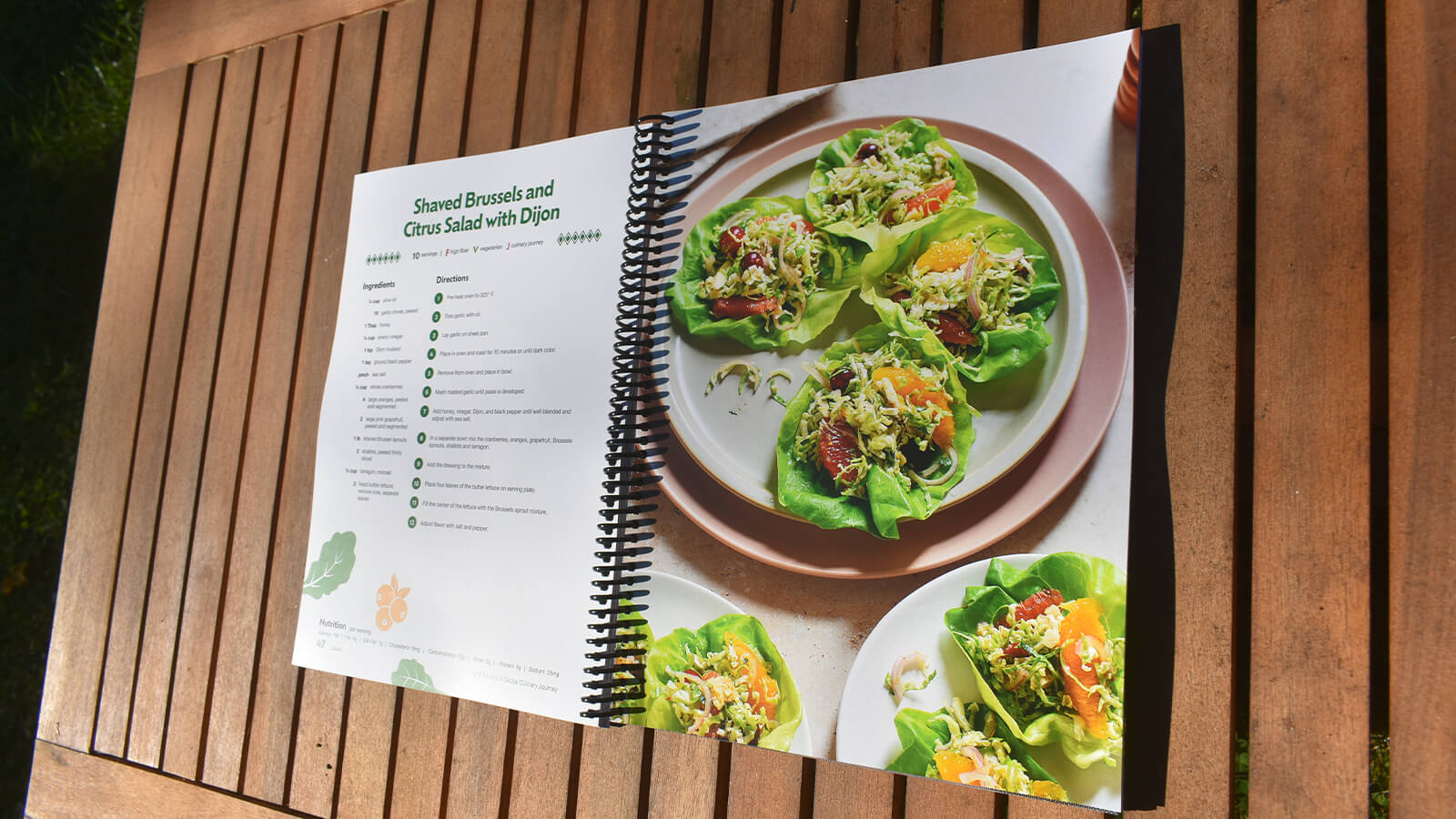
The team had also landed on a visual style for the food photography that was colorful, pattern-rich where possible, and a bit more dynamically-lit, all in service of reinforcing the international feel of the recipes. At this point, an Attention Span partner and food photographer was brought onboard to help prepare and photograph the recipes.
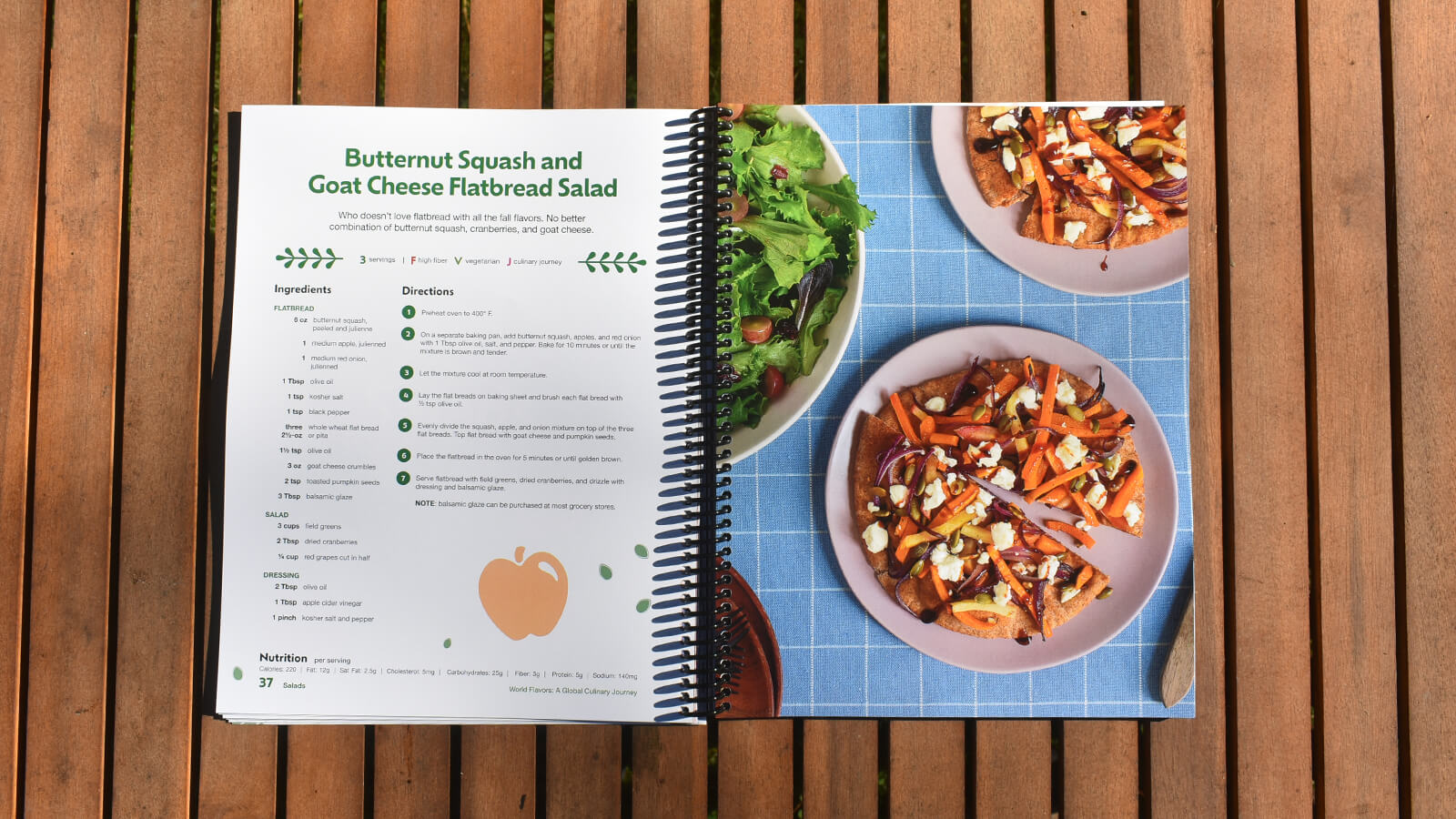
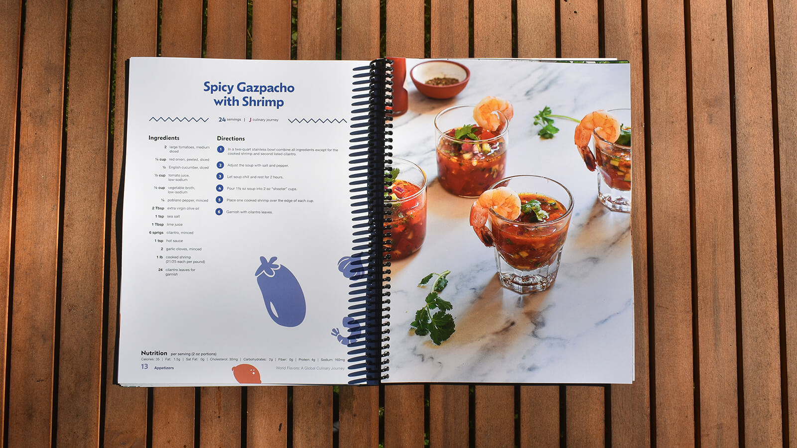
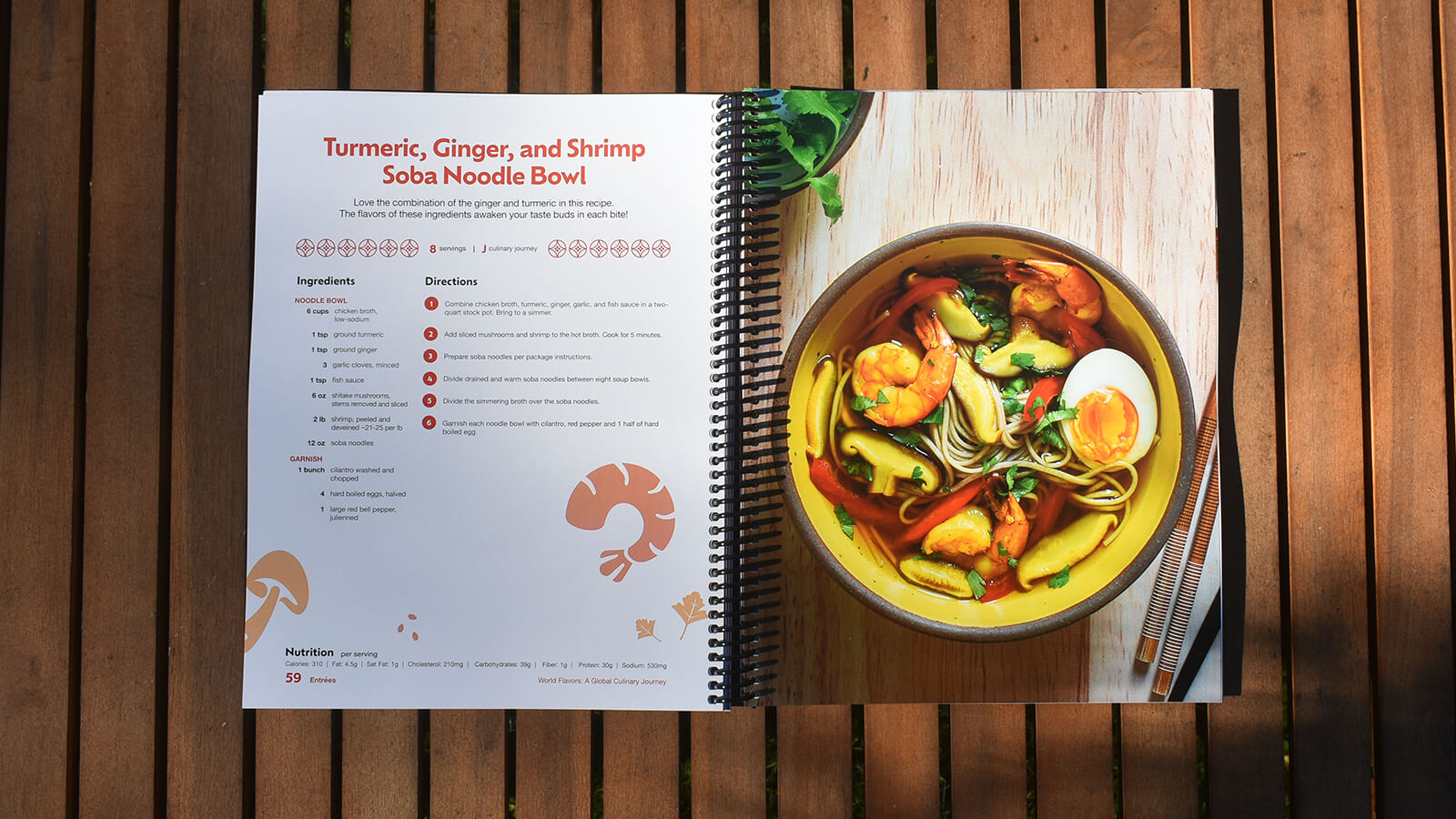
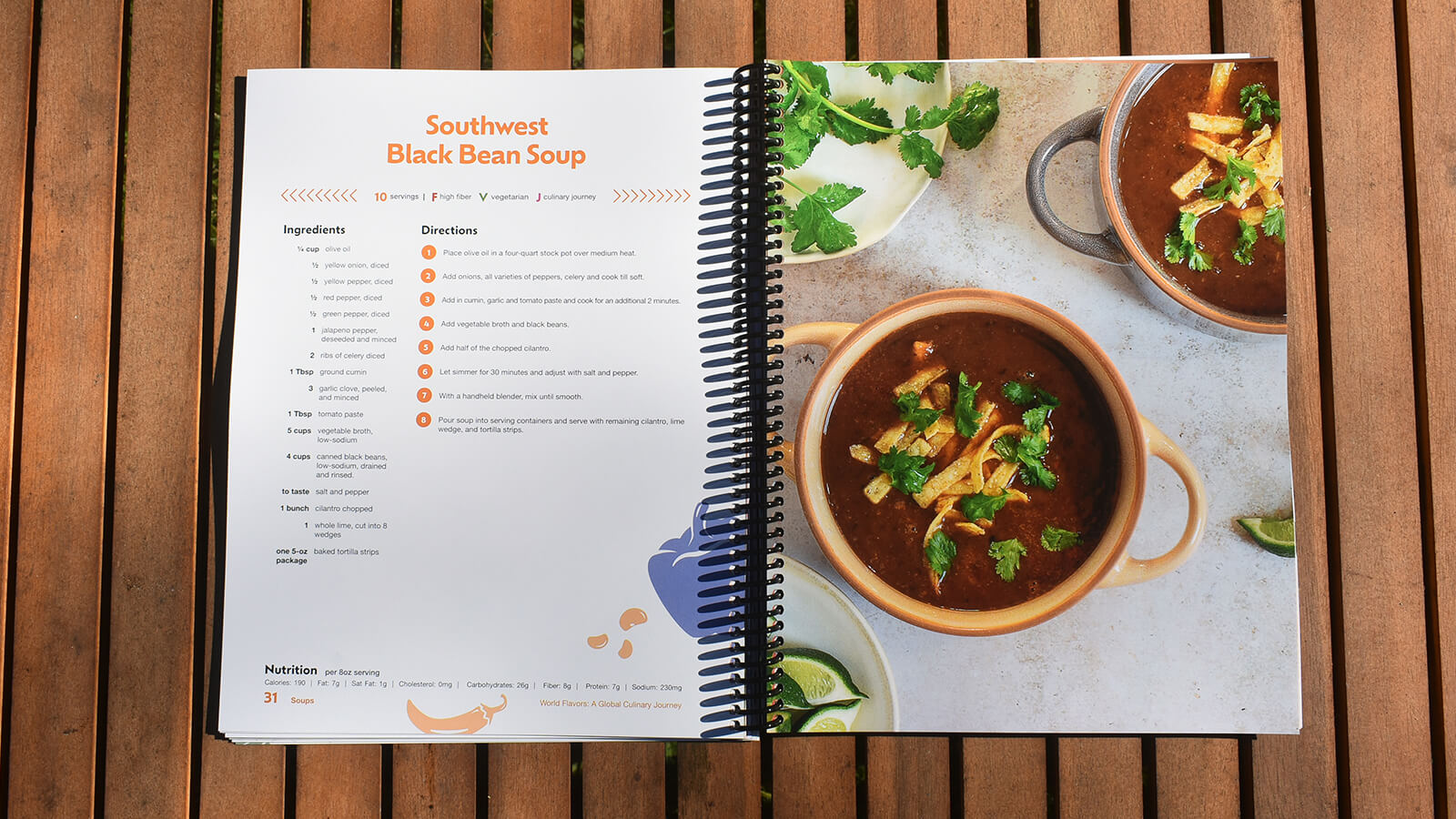
A few critical design decisions that were made during the process of designing and laying out each recipe page:
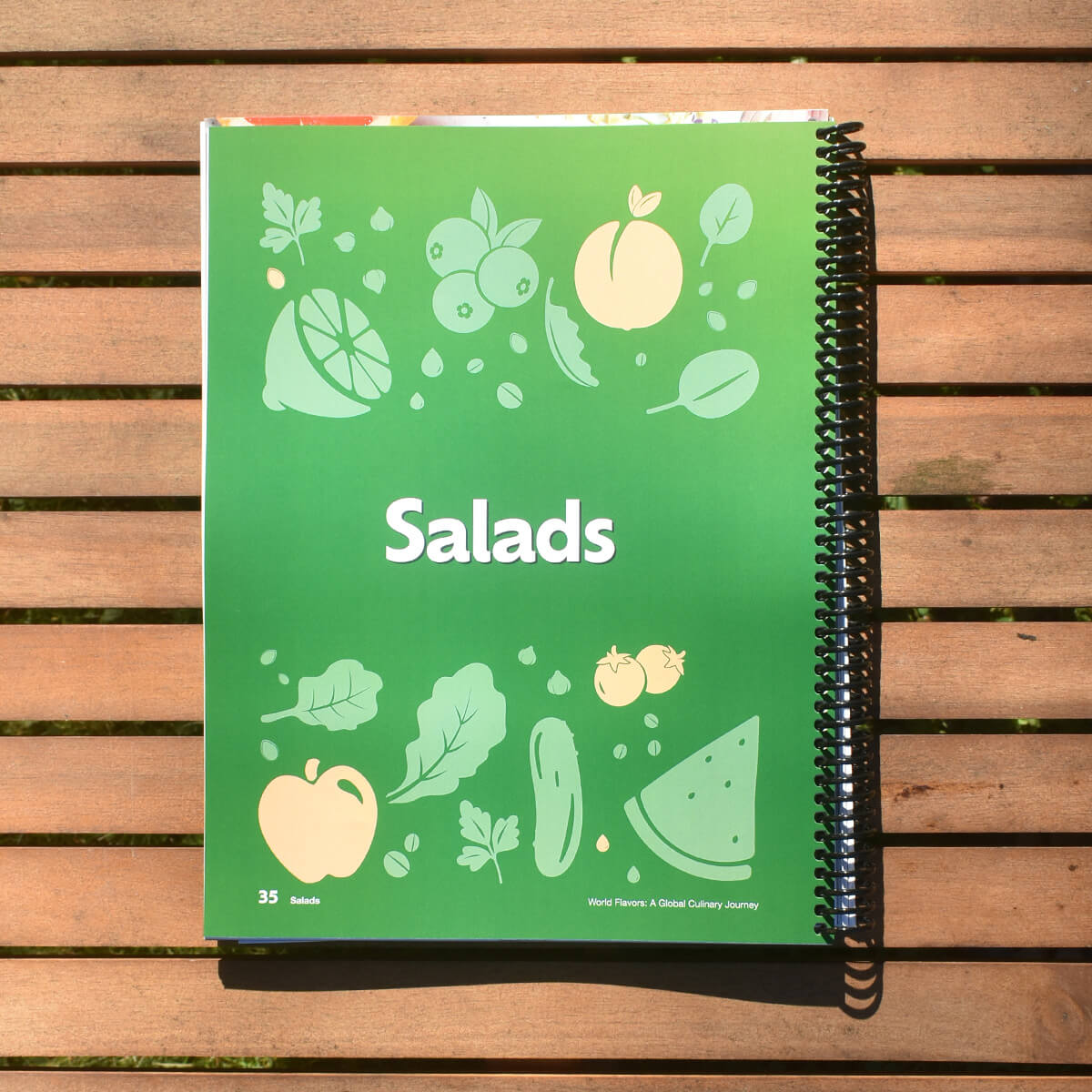
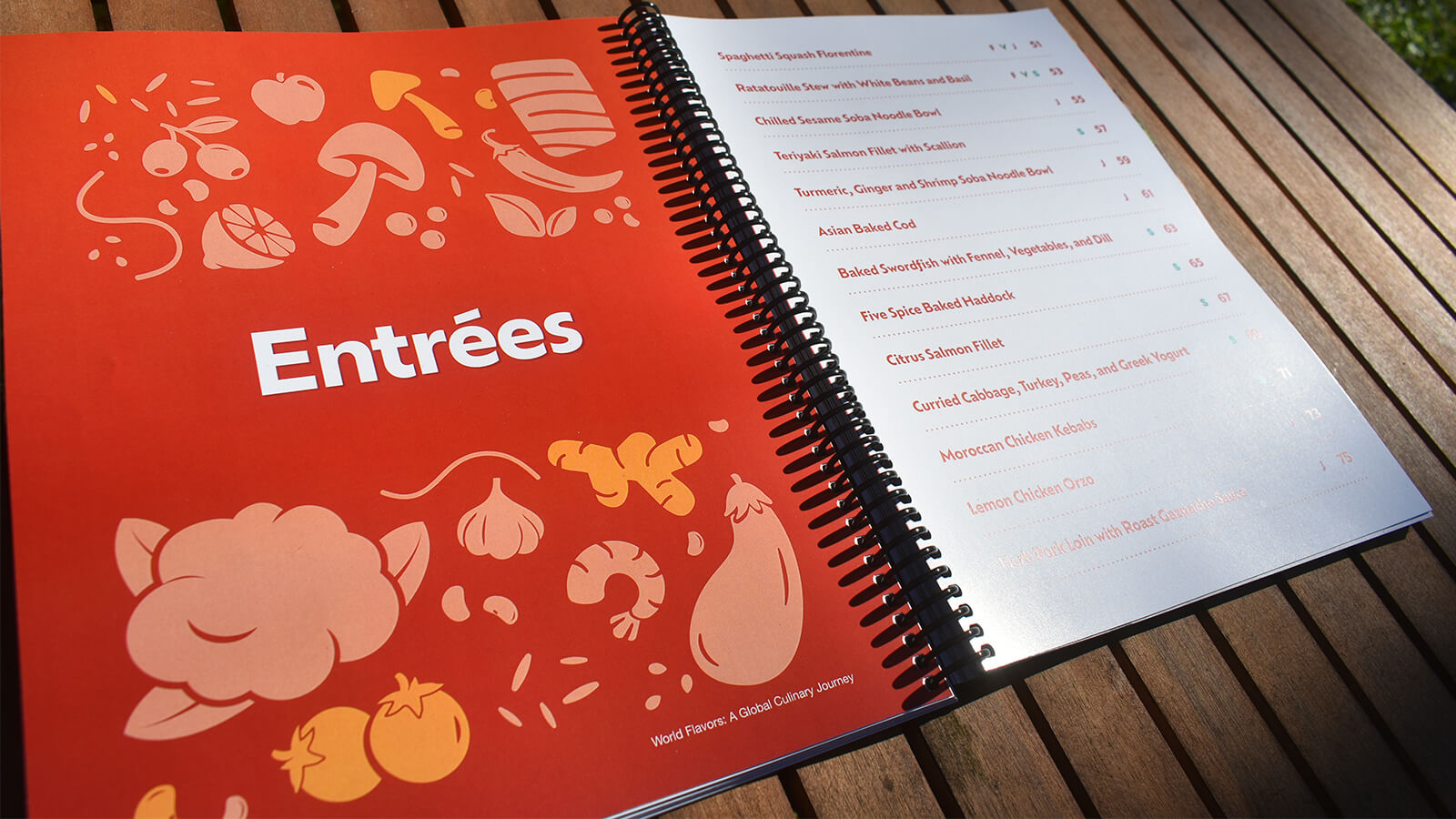
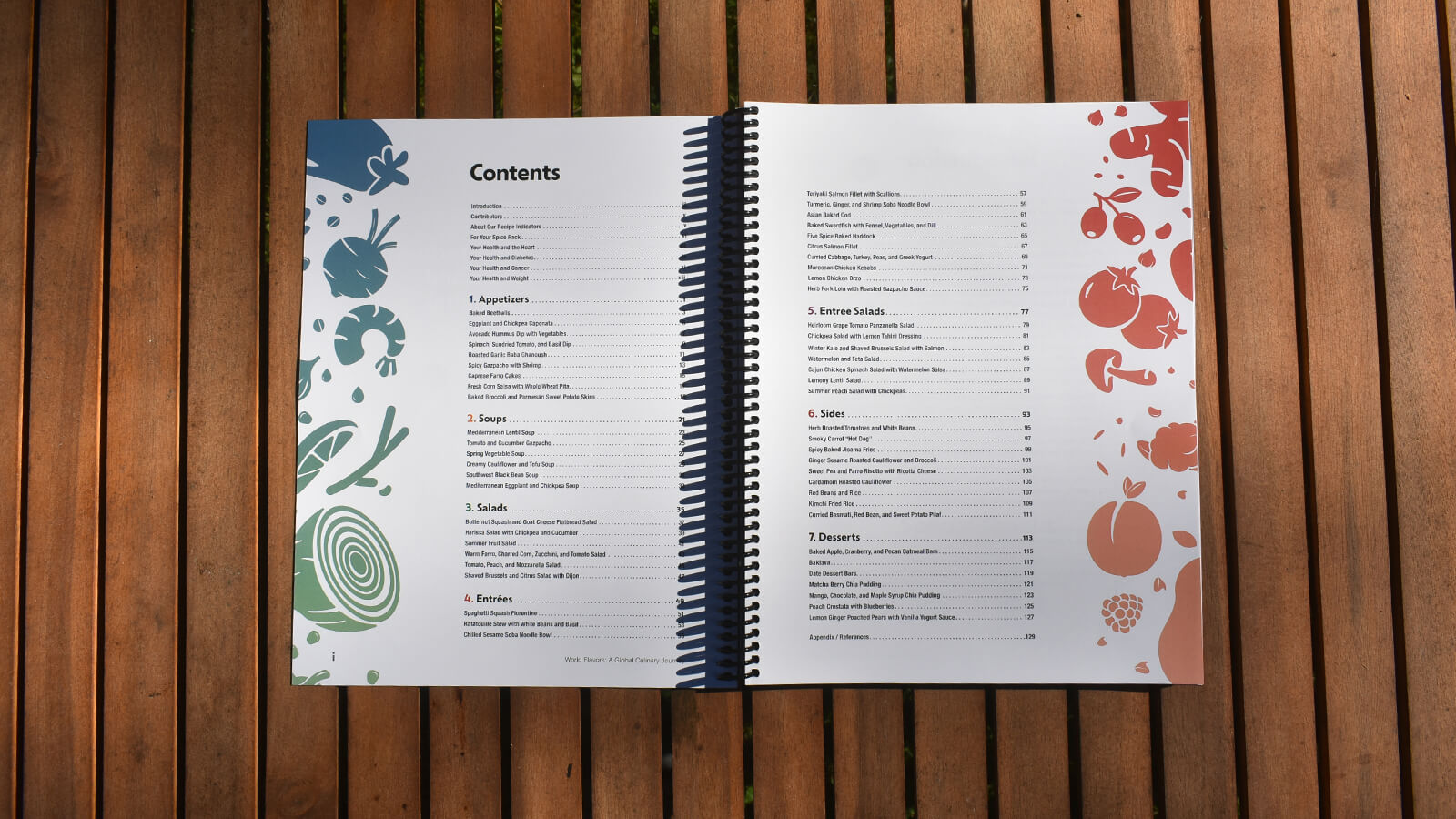
- Each section (sides, salads, desserts, etc.) got its own combination of colors. This helps readers quickly scan the book for what they’re looking for and adds a brightness and vibrancy to the book overall without making each spread too loud.
- Once the final photography began rolling in, we knew we needed to ensure our work did not compete with it but enhance it.
- The spreads needed a hint more of the “international” feel. The addition of the border elements helped bring that in without fighting with the other elements on the page.
- Adding simple ingredient illustrations helped address an ask from the client to bring out a bit more color overall, without over-saturating the book.
Results
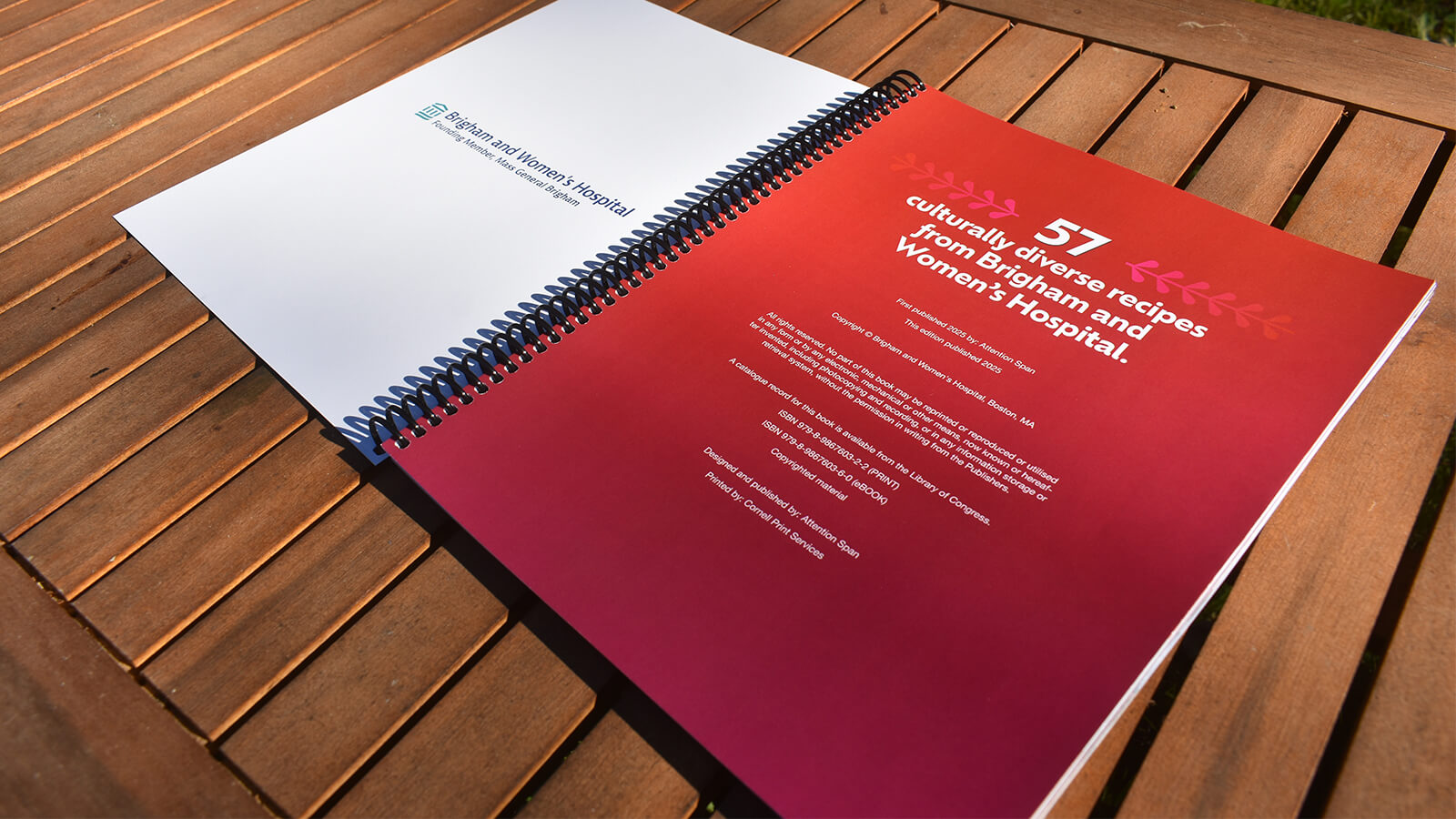
The final product is a beautifully designed cookbook that’s as practical as it is nice to look at. The Brigham and Women’s team is prescribing the cookbook to their patients as a way to help with nutrition education and improvement, and it’s also available for purchase online. All proceeds are a donation to the Brigham and Women’s Hospital.
